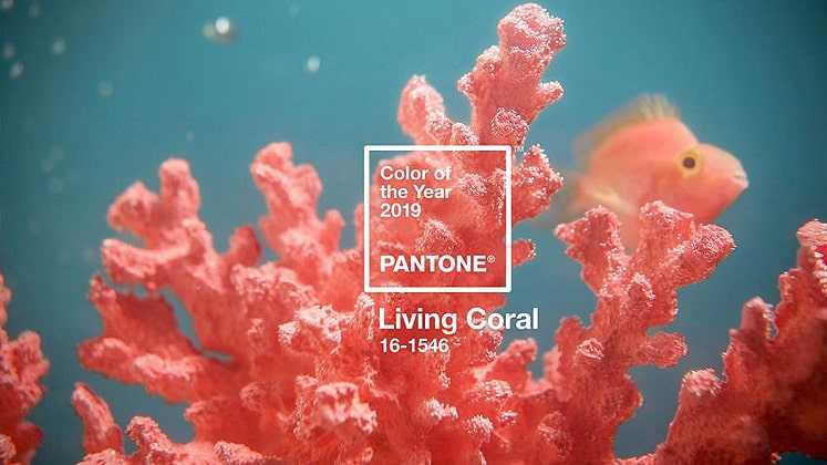
Pantone has announced the Colour of the Year for 2019- an “animating and life-affirming coral hue with a golden undertone that energizes and enlivens with a softer edge”, Living Coral, is the vibrant, yet mellow choice for the upcoming year.
Trend forecasts and predictions always carry a serious message pertaining to the ties along with them, to this, Pantone references its context to the “onslaught of digital technology and social media that is increasingly embedding into daily life”, and making us seek “authentic and immersive experiences that enable connection and intimacy. Sociable and spirited, the engaging nature of PANTONE 16-1546 Living Coral welcomes and encourages light-hearted activity.”

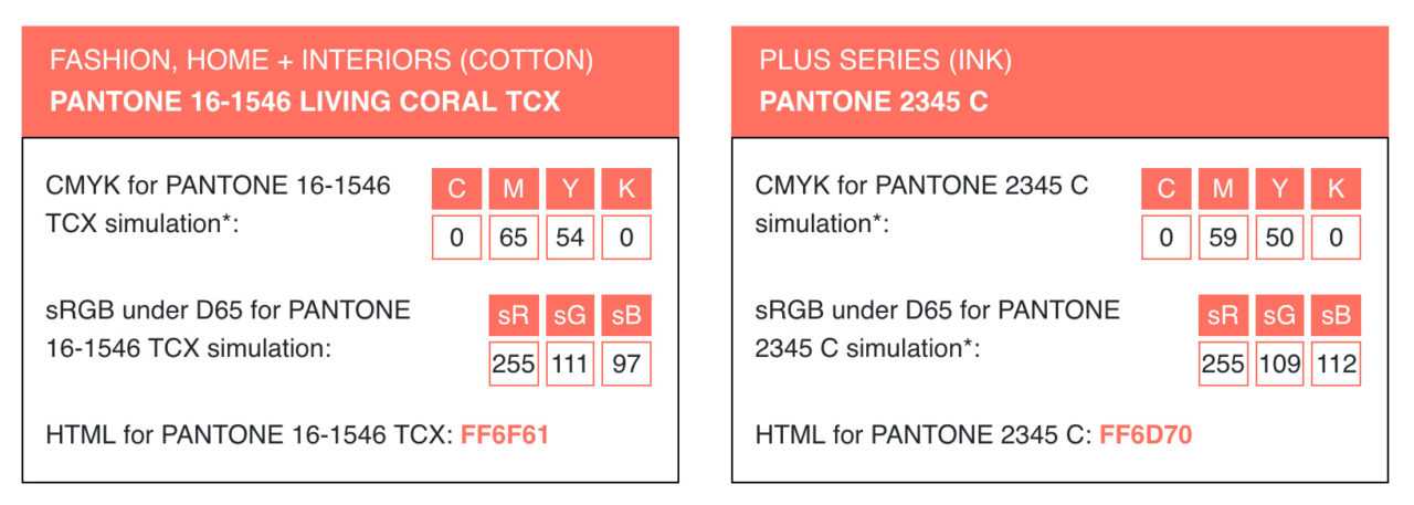
The colour codes/values for Living Coral are as follows:-
PANTONE 16-1546 TPX
RGB 250 114 104
HEX/HTML FA7268

Ahead of this declaration, the recently concluded runways were already awash with the peachy pink hue- posing as a vivid summery tone. Tapping on the playful aspect of the colour, designers such as Peter Pilotto, Prada, Brandon Maxwell, Elisabetta Franchi, and Roksanda worked the gradation over tailored separates and beach wear staples. Scroll through the gallery to see how these designers presented the colour for Spring Summer 2019.
It is pertinent to mention here that from a designer’s point of view, it is about the combination of colours, not just a specific one. Hence, it remains to be seen how designers and interior specialists conjure up blends to aesthetically place this colour in their offerings in the year to come.
Lying at the center of our naturally vivid and chromatic ecosystem, PANTONE Living Coral is evocative of how coral reefs provide shelter to a diverse kaleidoscope of color. – Pantone.
Inspired by the natural pigmentation occurring in healthy ocean coral reefs, this symbolism also poses as a blaring contrast to the headlines that scream about climate change and the associated destruction of reefs worldwide. Perhaps, this also serves as a wake-up call cloaked in the comfort and buoyancy of this vivid tone.
The Pantone Color Institute is the business unit within Pantone that highlights top seasonal runway colors, forecasts global color trends, and advises companies on color for product and brand visual identity.
For 20 years, Pantone’s Color of the Year has influenced product development and purchasing decisions in multiple industries, including fashion, home furnishings, and industrial design, as well as product, packaging, and graphic design.
Previous Colors of the Year have been Ultra Violet in 2018, Greenery in 2017, and Rose Quartz in 2016.

Leave a Reply